Getting someone to light on your website is a lot like baiting flies with honey. We use colors that fit the emotions and interests of people you want to bring into your website. The wrong colors are like vinegar to flies.
We have to go back to understand what you know about your potential customers. Different colors work for different messages. There are a few rules of thumb. Business websites are usually enhanced by a blue theme; it's business-like, I suppose. Green colors work for sites dealing with finances--just watch the color schemes used in television commercials about financial advisors. Bright colors like yellow and red work with websites that feature activity and movement. But, rules of thumb are not enough.
It takes the right combination of colors--a color scheme. There are plenty of tools that help to create color schemes with selections of color that work together. Those tools are scientifically designed to ensure that the selection of colors work together--it's math. Some of the best are
- Coolors: https://coolors.co/
- Adobe's Color Wheel: https://color.adobe.com/create/color-wheel
- Palletton: https://paletton.com/#uid=1000u0kllllaFw0g0qFqFg0w0aF
- Accessible Palette: https://accessiblepalette.com/
- RGB Chart & Multi-Tool: http://www.perbang.dk/rgb/7F9244/
With this information, you have science and math on your side, but you still have thousands of attractive color schemes from which you can select one for your customers. That brings us back to some of the basics. What do you know about your customers? What do you as a website designer understand about how you market to your customers?
How about an example? As a website developer, I was approached by a potential customer to build a website for a home remodeling company. He had a professionally developed website done by one of the big outfits; he wasn't satisfied. The rule of thumb about using blue for a business website failed. Why? The color schemes currently popular for kitchen and bathroom remodels are neutral tending toward warm. Blue is cold. The big design company completely missed the kind of color scheme that would be in the mind of a family planning to remodel their home--especially their kitchen or bathroom.
 Here's a screenshot of a proposed redesign. I used the Coolors tool to analyze the colors in a kitchen photograph to derive a new home page with an improved color scheme. Here is the scheme: (The yellow in the screenshot is an accent color designed to draw attention to a message.)

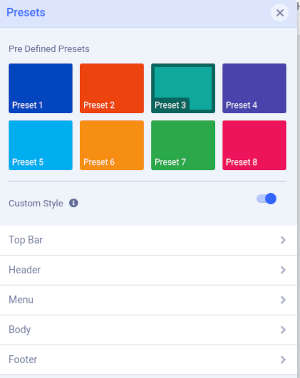
 That's a start, but as a designer, you still have to design how you'll use the scheme. Fortunately, some templates and frameworks make that easy. I prefer Joomshaper's Helix framework with the Helix-Ultimate template. It comes with several pre-set color schemes. In this case, I made a custom scheme where I could set the colors for different screen elements. Once I created the custom style, I used Joomshaper's SP Pagebuilder to create pages for the website. Because I had already selected the colors as well as the typography (fonts) and other custom settings for the layout and appearance, I did not have to specify any additional css rules for colors or fonts.


